
HTML - 콘텐츠 블록과 절대좌표
-
앱을 닮아가는 웹의 레이아웃 기법
-
flex 를사용하면 배치를 수평또는 수직으로 할수있다.
-
grid 배치도 있음
-
포지션 기법 4가지
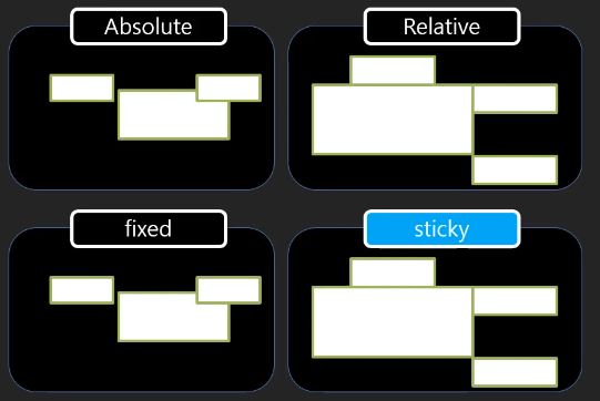
절대 위치
layout.html
<!DOCTYPE html>
<html lang="en">
<head>
    <meta charset="UTF-8">
    <meta http-equiv="X-UA-Compatible" content="IE=edge">
    <meta name="viewport" content="width=device-width, initial-scale=1.0">
    <title>Document</title>
    <link href="layout.css" type="text/css" rel ="stylesheet">
</head>
<body>
    <section id ="s1">
        <h1>포지션 : absolute</h1>
        <ul>
            <li>1</li>
            <li>2</li>
            <li>3</li>
        </ul>
    </section>

</body>
</html>
layout.css
@import url(css/reset.css);

#s1 ul {
    height: 300px;
    background: yellow;
    position: relative;
}

#s1 li:nth-child(1){
    background: red;
    position: absolute;
    width: 20px;
    height: 100%;
    right:0px ;


}

#s1 li:nth-child(2){
    background: green;

}

#s1 li:nth-child(3){
    background: blue;
}
절대위치에 대한 실습을 하였다.
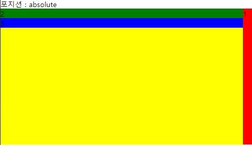 -> 1번이 컨텐트를 벗어나서 부모영역안에서 직접지정한 절대위치를 가진다. 위치를 지정했을때 그림처럼 형제도 덮어쓴걸볼수있다.
- absolute : 내가원하는 절대위치에 가게하는것
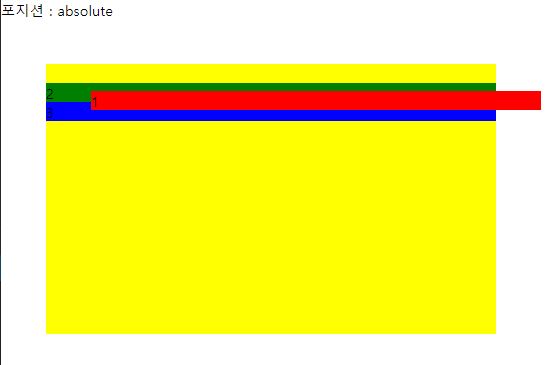
상대위치 relative
- position: relative; -> 특징은 자기가 가지고있었던 위치를 동생들이 가지지못하게한다는것. ```css @import url(css/reset.css);
#s1 ul { height: 300px; background: yellow; width: 500px; position: relative; left: 50px; top: 50px;
}
#s1 li:nth-child(1){ background: red; position: relative; left: 50px; top :30px; }
#s1 li:nth-child(2){ background: green;
}
#s1 li:nth-child(3){ background: blue; }
## 고정위치 fixed
```css
@import url(css/reset.css);
#s1 ul {
background: yellow;
}
#s1 li:nth-child(1){
background: red;
}
#s1 li:nth-child(2){
background: green;
position: fixed;
bottom: 0px;
width: 100%;
}
#s1 li:nth-child(3){
background: blue;
}
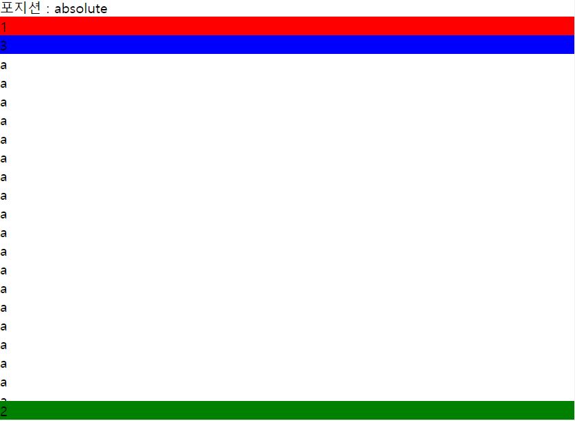
- fixed : 기준이 브라우저화면영역에 고정되는것이다. (스크롤을 내리면 따라다님)
붙임위치 sticky
- 모바일 웹이 등장하면서 자주사용한다.
- 위치를 고정시키면서 fixed 같은 효과를 주고싶을때 사용한다.

댓글남기기