
HTML - flex-lines(drection, wrap, flow)
- flex-wrap
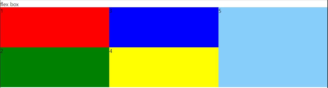
nowrap : 내려쓰기를 하지않고 오른쪽으로 쭉 펼치고싶다. (내려가지못하게함)
- 수직방향에서의 wrap 은 높이가 itme 들의 높이보다 작아야만 적용이된다. ex) ```css .felx-box{ border: 1px solid gray; display: flex; flex-flow : column wrap; height:250px; }
.item { flex-basis :100px; }
-> 만약에 위의 수직방향 래핑에서 여백을 채우려면 item에 flex-grow:1을 해주면된다.

```css
@import url(css/reset.css);

.s1 ul {
    display:  flex;
    flex-direction: row;
    background: gray;
    flex-flow : column wrap;
    height: 250px;
}

.s1 li{
    flex: 0 0  100px; /* 1 1 100px */
    flex-grow: 1;

}

.s1 li:nth-child(1){
    background: red;

}

.s1 li:nth-child(2){
    background: green;
}

.s1 li:nth-child(3){
    background: blue;
}

.s1 li:nth-child(4){
    background: yellow;
}

.s1 li:nth-child(5){
    background: lightskyblue;
    flex-grow: 1;
}
댓글남기기