HTML -align-items/align-content/align-self
-
수직 정렬하기 align-time: flex-start | flex-end | center | baseline | stretch
-
align-items: center;
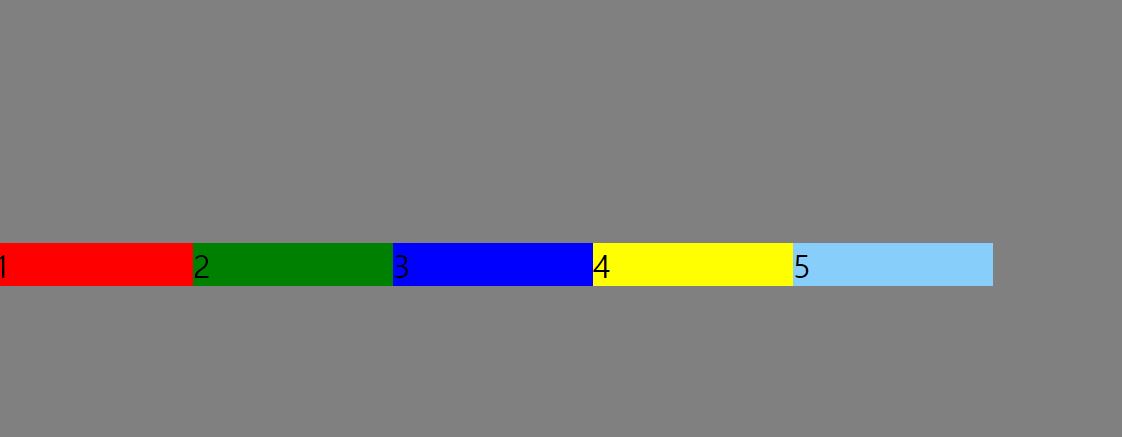
- align-self : flex-start, flex-end ```css
.s1 ul { height: 300px; display: flex; background: gray; align-items: center; } .s1 li{ flex-basis: 100px;
}
.s1 li:nth-child(1){ background: red; align-self: flex-start; }
.s1 li:nth-child(2){ background: green; align-self: flex-end; }
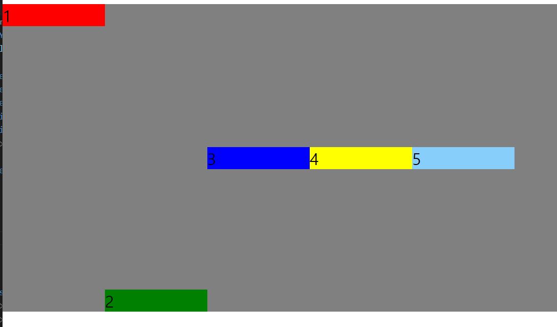
- align-items: baseline;
```css
@import url(css/reset.css);
html,
body {
height: 100%;
}
.s1{
height: 100%;
}
.s1 ul {
height: 300px;
display: flex;
background: gray;
align-items: baseline;
}
.s1 li{
flex-basis: 100px;
}
.s1 li:nth-child(1){
background: red;
align-self: flex-start;
}
.s1 li:nth-child(2){
background: green;
align-self: flex-end;
}
.s1 li:nth-child(3){
height: 100px;
background: blue;
margin-top: 10px;
font-size :100px;
}
.s1 li:nth-child(4){
background: yellow;
}
.s1 li:nth-child(5){
background: lightskyblue;
}
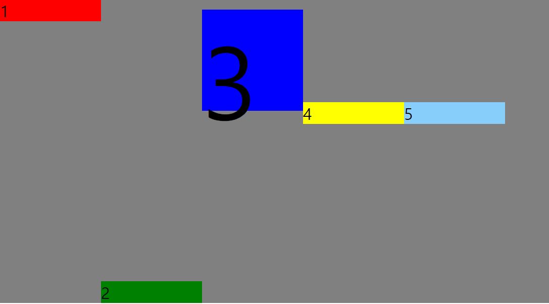
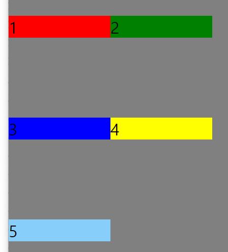
- align-items: center; ```css
.s1 ul { height: 300px; display: flex; background: gray; align-items: center; flex-wrap: wrap; }
align-items: center;로 주게되면 각층에서 가운데로 정렬이된다.
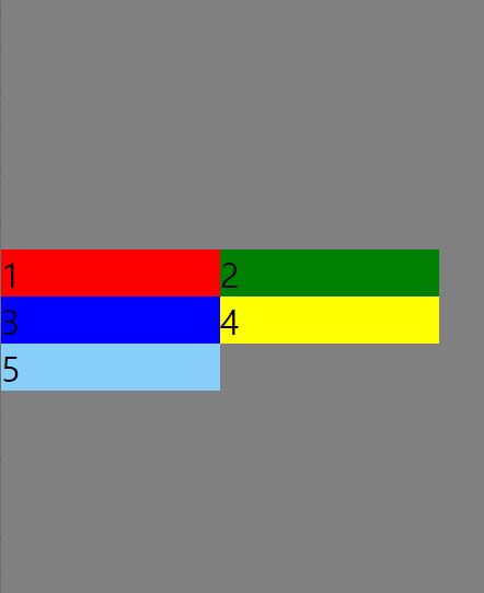
- align-content: center;
```css
.s1 ul {
height: 300px;
display: flex;
background: gray;
align-content: center;
flex-wrap: wrap;
}
층을 무시하고 하나 패킹후 가운데로 정렬한다.
댓글남기기